Ethereum Taps Highest Levels Against Bitcoin Since January Amid Market Downturn (ETH Price Analysis)
The crypto market is heavily influenced by events attributed to the Luna ecosystem. Investors are depositing their assets into exchanges with fear caused by the possible sell-off continuation.
Technical Analysis
By Grizzly
The Daily Chart
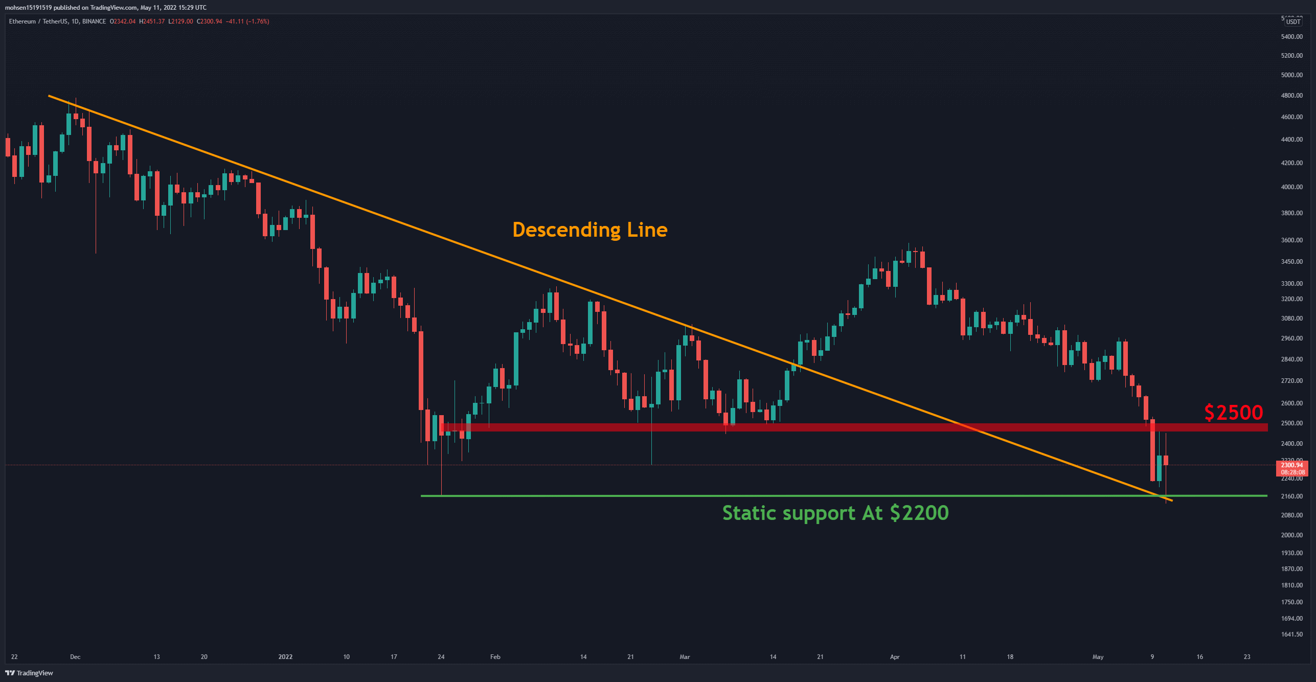
ETH stands on horizontal support (in green) on the daily timeframe last touched in January. This level intersects with the descending line (in orange), which may have persuaded some participants to buy at this point.
This technical structure has caused a price increase. ETH has recently lost significant levels, the first of which is $2,500 (in red). Until the price reclaims this level, the current upward movement can be technically considered a bounce.
On the other hand, the last price high on the daily timeframe is relatively far from the current price. ETH needs to confirm a possible uptrend through a closing above $3,000 – only then can the trend be considered reversed.
Key Support Levels: $2200 & $1700
Key Resistance Levels: $2500 & $3000
Moving Averages:
MA20: $2748
MA50: $3018
MA100: $2912
MA200: $3390
The 4-Hour Chart
On the 4-hour timeframe, the RSI indicator has entered the oversold zone – unprecedented since January. ETH can be expected to recover slightly in this area. But whether the price can move as strongly as in January is unclear because the macroeconomic conditions are very different from then.
The ETH/BTC Chart
Unlike most BTC pair charts, ETH/BTC chart is technically bullish and moves upward within an ascending channel. But the recent ascending leg that starts from the bottom of the channel is not as strong as the previous ones.
Weakness is observed in the upward movement, and the horizontal support at 0.07 BTC is likely to be retested. Therefore, as long as the price moves inside this channel and above the horizontal support at 0.064, one can have bullish insight.
On-chain Analysis
Supply On Exchange vs Supply Held By Non-Exchange Addresses
As mentioned in the technical analysis, the selling pressure in the market is high, and the participants have deposited their assets aggressively into the exchanges over the last 72 hours.
This behaviour is specified in the Supply On Exchange metric. This metric has recently spiked sharply, which usually indicates an increase in the selling pressure. On the other hand, the supply held by non-exchange addresses has decreased slightly. It remains to be seen whether this increase in supply on exchanges will cause the price to drop further.
Binance Free $100 (Exclusive): Use this link to register and receive $100 free and 10% off fees on Binance Futures first month (terms).
PrimeXBT Special Offer: Use this link to register & enter POTATO50 code to receive up to $7,000 on your deposits.
Disclaimer: Information found on CryptoPotato is those of writers quoted. It does not represent the opinions of CryptoPotato on whether to buy, sell, or hold any investments. You are advised to conduct your own research before making any investment decisions. Use provided information at your own risk. See Disclaimer for more information.
Cryptocurrency charts by TradingView.
Credit: Source link


 Bitcoin
  Ethereum
  XRP
XRP  Tether
  Solana
  Dogecoin
  USDC
USDC  Cardano
  Lido Staked Ether
  TRON
TRON  Avalanche
  Sui
Sui  Toncoin
  Wrapped stETH
  Stellar
  Shiba Inu
  Chainlink
  Wrapped Bitcoin
  Hedera
  Polkadot
  WETH
WETH  Bitcoin Cash
  LEO Token
  Uniswap
  Litecoin
  Pepe
Pepe  Hyperliquid
  Wrapped eETH
  USDS
USDS  NEAR Protocol
  Ethena USDe
  Aptos
Aptos  Internet Computer
  Aave
Aave  Mantle
  POL (ex-MATIC)
  Ethereum Classic
  Cronos
  Render
  Monero
  Bittensor
  MANTRA
  Dai
Dai  Artificial Superintelligence Alliance
  Filecoin
  Arbitrum
  Algorand
Comments are closed.